Each 2021 NBA City Jersey Ranked
A ranking of the new 2021 city uniforms for the NBA season ranked*
December 26, 2020
This year’s NBA City jerseys were carefully evaluated and ranked accordingly:
- Cleveland Cavaliers: When looking at these jerseys, I overall like the idea of them. The roots stem from the rock and roll origins in Cleveland. The lettering is unique, but other than that, it is downright plain. This jersey is like the Cavs themselves–boring.
- Detroit Pistons: The Pistons managed to downgrade from the mediocre city jersey from 2019. The Pistons continually try to work on the idea that they are the mecca of automobiles. This jersey has good colors, but it is not an eye-catching design in general.
- New Orlean Pelicans: With an extremely young and talented roster, you would expect the Pelicans to try something new. Instead, they decided to use the New Orleans flag as their example. The concept is cool, but with the simple flag of the City, it is mostly plain white. It’s a good idea, but the limiting factor of the jersey is the boring nature of its inspiration.
- Los Angeles Clippers: I was a huge fan of the 2019 Clippers city jerseys, but like most fans, I was not thrilled to see them bring them back right away. The jerseys are the EXACT same, minus a few color changes to the sleeves. I was hoping to see something new and for that reason, so it’s near the bottom of this list.
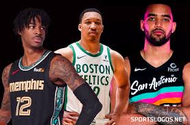
- Boston Celtics: The Celtics organization can not make a good alternate jersey. The Celtics always honor the past of the Celtics, but we really want to see them show us something new. This jersey is so plain that when I first saw the leak, I thought it was one of the practice jerseys. It’s plain, and with this year’s talented team, it is also a disappointment.
- Washington Wizards: One of the common patterns at the bottom of this list is not changing things from last year. The jersey is the same as the 2019 city jersey, but the color changed from white to grey. Honestly, the reason it ranks this high is the jersey looks good. It’s clean and represents the nation’s capital–I just wish they had changed it up.
- Utah Jazz: The Jazz changed their 2019 jersey ever so slightly. Once again the same as the Wizards, they changed the primary color to black but kept the pattern. It’s visually pleasing and reminds me of a Utah desert sunset. This jersey is simple, yet it works very well.
- Houston Rockets: I respect the boldness of the rockets this year. The team has primarily always worn red; however, this year they decided to wear a great tone of baby blue. The nickname “H-Town” sprawled across the front is unique and looks good. The blue is clean, but the color does not fit the franchise.
- Oklahoma City Thunder: The OKC Thunder truly tried to make something unique with this one. When I first saw this I thought it was amazing: the colors meshed well, and the team had never worn black. As time passed, this jersey just looks okay in my mind–nothing special. It is a good attempt but falls flat due to it looking like I made it in the second grade.
- Denver Nuggets: This portion of the list is the jerseys that are close to great. The NBA did a great job this year, and most of them are good, in my opinion. The colors on this jersey work really well together, and the design is classic in Nuggets history. This jersey will probably look better when the players are rocking it in-game, but for now, it’s at 20.
- Minnesota Timberwolves: The Green on this jersey is one of the cleanest colors I have seen on a jersey. The hits of the neon green make the jersey look fresh and new. The use of Minn as the primary name looks good–it is very simple and unique. I think the jersey itself is a little plain, and that’s why it falls so low.
- Sacramento Kings: The black jersey with the hints of the old school Sacramento blue and red looks very clean. The use of the city nickname of “Sactown” is something they are bringing back from last season, and personally, I think it’s a nice nod to the city. This jersey has a checker pattern down the rib cage, and to put it simply, it works. This jersey looks a little weird in the promotional pictures, but when the players start wearing them, I could see this becoming a fan favorite in the future.
- Toronto Raptors: The Raptors decided to go back to the gold and black format of past city edition jerseys. This is a nod to the longtime Raptors fan Drake–the rapper’s brand OVO uses the same colors. I like the jersey, but honestly, they go back to the same style every time. They like to make it look like a raptor scratched the front of the jersey. The colors work, but the logo is tired in relation to the team.
- Dallas Mavericks: The Mavs decided to use a simple design with a clean gold and white colorway. I really like the jersey, but it does not stand out to me as one of the “greats” of this new collection. I just think it’s kind of plain and does not have enough small details that make the jersey unique to Dallas.
- Milwaukee Bucks: This jersey’s main problem is that blue is not one of the primary colors of the Bucks. The team hasn’t worn a blue primary jersey ever, but I think this jersey is so high up due to its meaning. The water style is supposed to stand for what they say is “The Great Lakes of Unity.” This is interesting because of the geological position of Milwaukee.
- Brooklyn Nets: Brooklyn pays homage to the hometown artist of Jean-Michel Basquiat, giving this jersey a special meaning that most of the other jerseys lack. I like the idea, but the artwork on the front visually does not truly look that appealing. This jersey has made its way to 14 by being one of the only jerseys with great symbolism to the Brooklyn area.
- Portland Trailblazers: A strange decision this year was to go away from the usual “Rip City” nickname to using “Oregon” as the main jersey title. Although the idea was nice, brown does not look great on many jerseys–this one included. It’s this high up due to the font and my favorite part: the side rib cage pattern. The jersey has a good concept, and it is something new, and I like it.
- Indiana Pacers: The Pacers took a retro look for this year’s city edition. This jersey uses the pinstripe design of the former Pacers jersey with a brighter colorway. I love the pinstripe look; it reminds me of 2000’s basketball. This jersey is overall a really good jersey.
- Chicago Bulls: Wow, these are nice jerseys. They are supposed to be a nod to the building of skyscrapers in Chicago, but to me, it looks like a reference to the Al Capone days. The lettering seems like it would be in front of an old-timey lounge in Chicago. I love the colors as well. The reason these fell below others is because of the confusing reference.
- Miami Heat: I love the Miami Vice theme that the Heat has gone with over the past couple of years. They have pink, blue, and white vice jerseys that have been fan favorites. This year, they decided to go with a pink and blue gradient. I really like them, but they resemble cotton candy a little too much.
- Memphis Grizzlies: The Grizzlies have made moves recently to make their jerseys better than the rest. The city jerseys this year pay homage to Isaac Hayes, a musician from the Memphis area. The jersey is somewhat simple, but the hints of blue on the sides look incredible with the gold and black.
- Philadelphia 76ers: I really love the black jersey that the sixers came up with this year. Using the skyline of Philly’s Boathouse Row as inspiration, point guard Ben Simmons helped design the jersey. The jersey looks really good, but I think it would have suited them better to go with the Allen Iverson era black jerseys.
7. Los Angeles Lakers: The Lakers decided to bring back the clean baby blue colorway of the classic Lakers jersey. The colors on this work; it’s a throwback jersey that a lot of people don’t remember. I don’t have any complaints about this amazing jersey.
- Golden State Warriors: The Warriors are going back to the classic Warriors jersey, switching the front title from “Warriors” to “Oakland.” This is an amazing idea considering Oakland is the home of the Warriors, yet they aren’t named after the city. These jerseys are classics and have been brought back better than ever.
- Atlanta Hawks: This jersey is one of the best I have seen in years. I love seeing the use of MLK to represent the civil rights movement that is so prominent in Georgia. The colors don’t necessarily “pop,” but the jersey is so clean it is one of the most unique jerseys in recent years. There is a difference between representing unique and actually putting the name of who you are representing on your chest.
- San Antonio Spurs: The Spurs have flopped for many years–one year they’d decide to go with a military print to talk about the military bases in the city, and the next year something else. This year, they decided to throw it back to the fiesta era times. The black with the colors work so well, so they made these jerseys perfect.
- Charlotte Hornets: The mint coloring on this jersey is one of the best palettes I have seen on a jersey. Combined with the pinstripes and the “Buzzcity” crest, this jersey is amazing. It’s unfortunate that such a bad team will be able to rock this good of a jersey.
- Orlando Magic: You may be seeing a pattern with some of my rankings: I love pinstripes, and the Magic did it even better than others. The orange and white represent the orange industry in Florida. The old-style logo looks so good in orange and is one of the best they have ever had.
- Phoenix Suns: This is my favorite jersey in the past ten years. I really enjoy the title of “The Valley”: it’s sleek and new. The colors of the sunset on a hill look amazing and create a good looking take on the sunsets. Lots of teams created a sunset visual, and this is the best one of the bunch.
*The New York Knicks have not yet released an official jersey